Buddy – the user friendly
dog walking service

Overview
The client, a startup in the pet care industry with the goal of creating a mobile app that connects dog owners with professional dog walkers in their local area
The app would need to provide an easy and efficient way for dog owners to find and book reliable dog walkers, while also allowing dog walkers to manage their schedules and connect with clients.
This case study delves into the journey of conceptualising, Designing, and launching Buddy.
The Problem
The client, a startup in the pet care industry with the goal of creating a mobile app that connects dog owners with professional dog walkers in their local area
The app would need to provide an easy and efficient way for dog owners to find and book reliable dog walkers, while also allowing dog walkers to manage their schedules and connect with clients.
This case study delves into the journey of conceptualising, Designing, and launching Buddy
The Goal
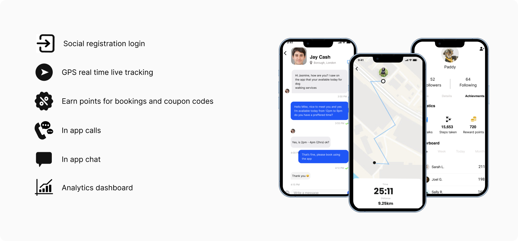
To address these issues, the idea would be to develop a mobile app that would allow dog owners to easily search for and book professional user-friendly dog walkers in their area.
The app would provide a platform for dog walkers to manage their schedules and communicate with clients, while also providing features such as GPS tracking, in-app messaging, and online payment processing.
My Role
My duties included the full UX/UI process. Researching and designing of a new functional ios prototype, and owning the entire process from the very beginning to the end of the testing.
Design Process
Using the design thinking process for the problem-solving approach involved empathy, ideation, and prototyping to create innovative solutions in order to get the ball rolling.
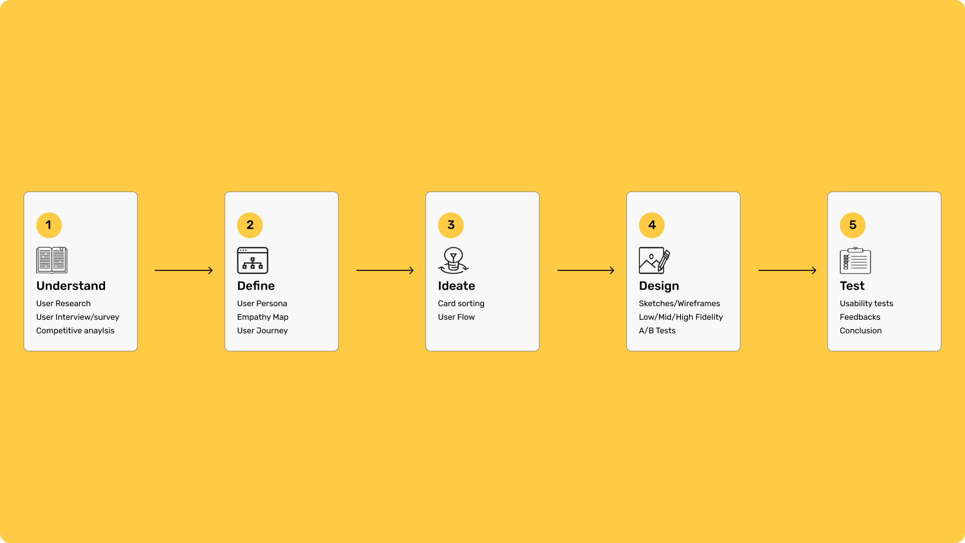
Understanding
Demographics
Age Groups: People that have limited mobility that require assistance in ensuring their dogs get regular exercise and outdoor time.
Working professionals: Individuals with full-time jobs who may not have enough time to walk their dogs during the day.
Location: Dog walking services are often more in demand in urban and suburban areas where people have busy lifestyles and limited time for regular walks.

User interviews
Quantitive answers
I Created a structured questionnaire to gather data from a number of (18) respondents.
Using various questions and interviews to fully grasp the needs frustrations and concerns of users. This all-inclusive strategy included people from a variety of backgrounds.
3 of the most commons questions were to do with the mental and physical well being about there dogs.

Survey responses and insights
I conducted a survey involving the same 18 participants using Google forms to record the responses to the questionnaires.
I used competitive research to existing data from the survey. Based on the information gathered from interviews,
I used competitive research to existing data from the survey. Based on the information gathered from interviews
Persona
Creating a UX persona for a dog walking app involved understanding the target user's needs, behaviours, and preferences.
Convenient Scheduling: Arman is a busy professional and needs a dog walking app that allows him to easily schedule walks at times that fit his hectic schedule.
Below is a representation to understand and empathise the needs, goal to behaviours of my target user’s.
I used competitive research to existing data from the survey. Based on the information gathered from interviews.

User journey
The user journey shows the emotional and visual traits of Arman’s experience
of what he achieves when looking for a dog walking service.

Empathy mapping
Empathy mapping involves understanding and visualizing the thoughts, feelings, actions, and needs of the user By creating this empathy map, helped to gain insights into arman's perspective, allowing addresses his concerns, meets the needs, and provides a positive user experience.
This understanding can guide features, messaging, and overall design decisions for the app

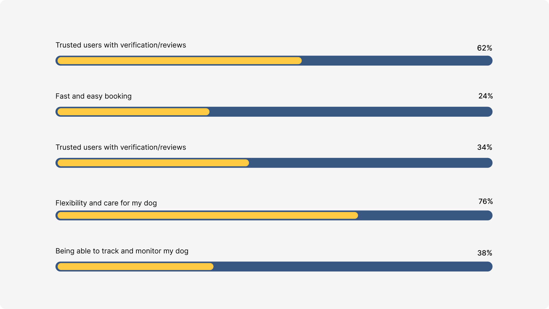
Opportunities
Based on the user-feed back it only made sense for me to capitalise and take the opportunity to note the benefits of having various options for which the app could involve or achieve.
Ideate
Card sorting method was used to help design or evaluate the standard structure of what the most important aspects of the app would involve.

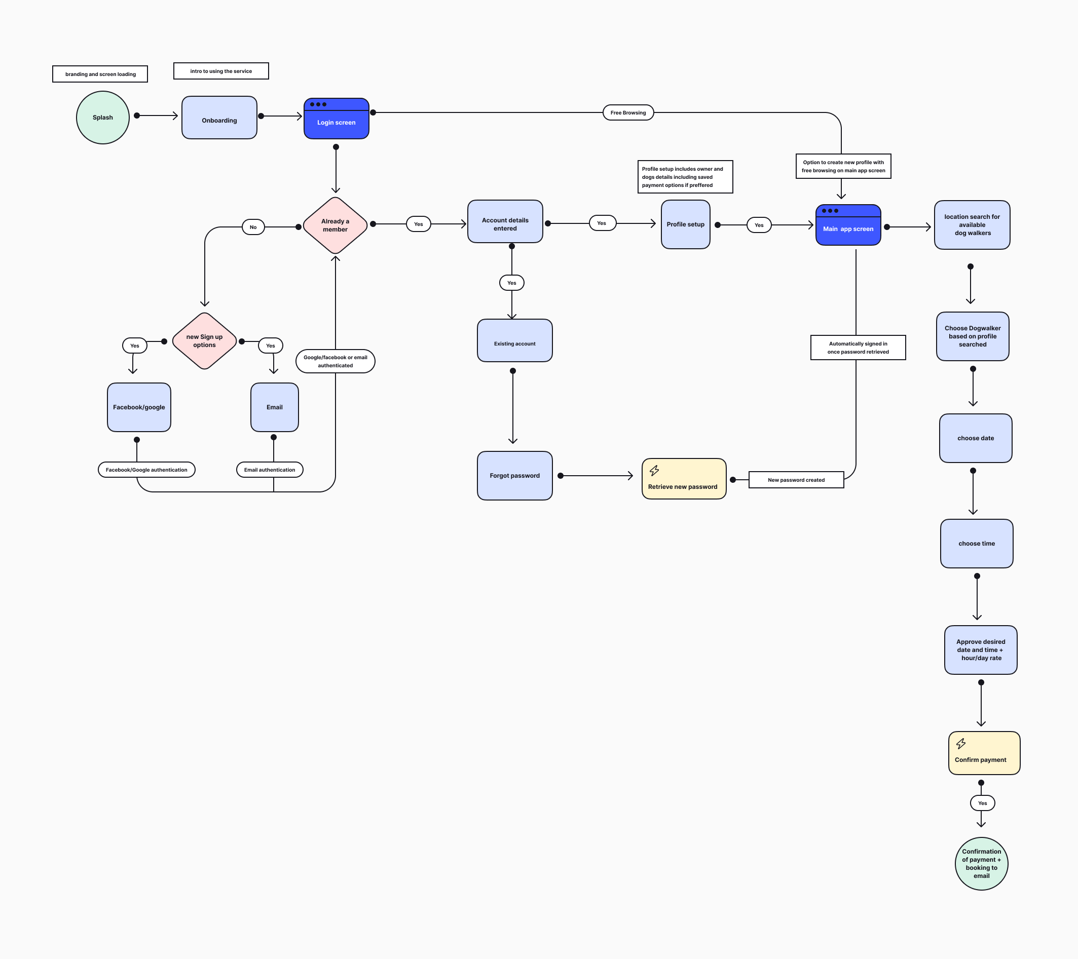
Userflow
The user flow describes how a user navigates the product, including every step they take from the point of entrance to the last interaction.
Design
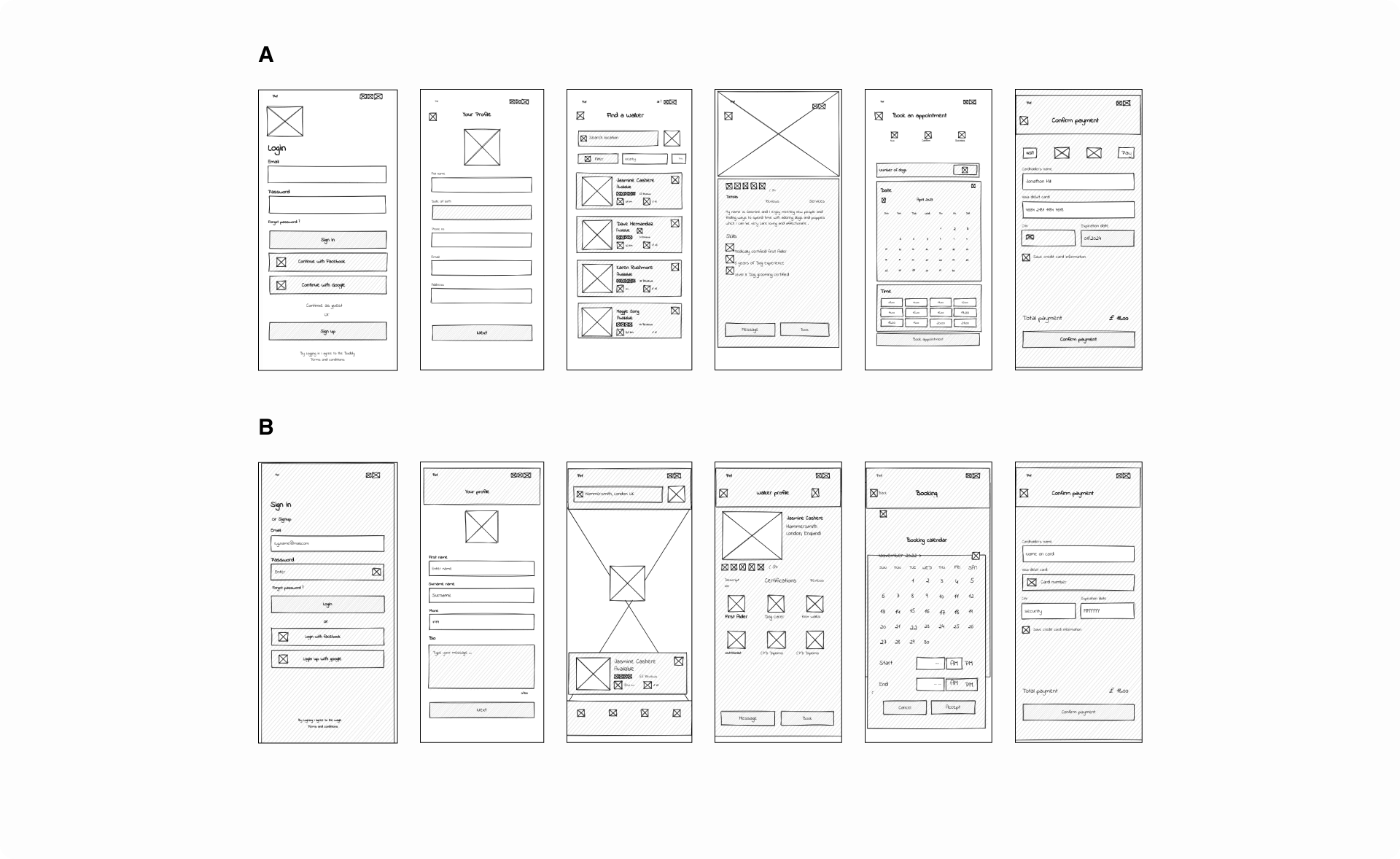
Creating low-fidelity designs for the app involved sketching out basic layouts and concepts without focusing on to much intricate details.
Annotations were added to explain certain functionalities or interactions. These low-fidelity wireframes are iterated upon and refined as I gathered more feedback and insights from users.
These designs helped to quickly test and iterating on ideas before moving to more polished visual designs

A/B Testing
I was stuck between two design decisions in which the approach to the journey of login, search and booking had different overall setup.
A/B testing would help me learn how small changes influence a users behaviour, deciding which approach towards design to implement on what works and what doesn’t work for my target users.
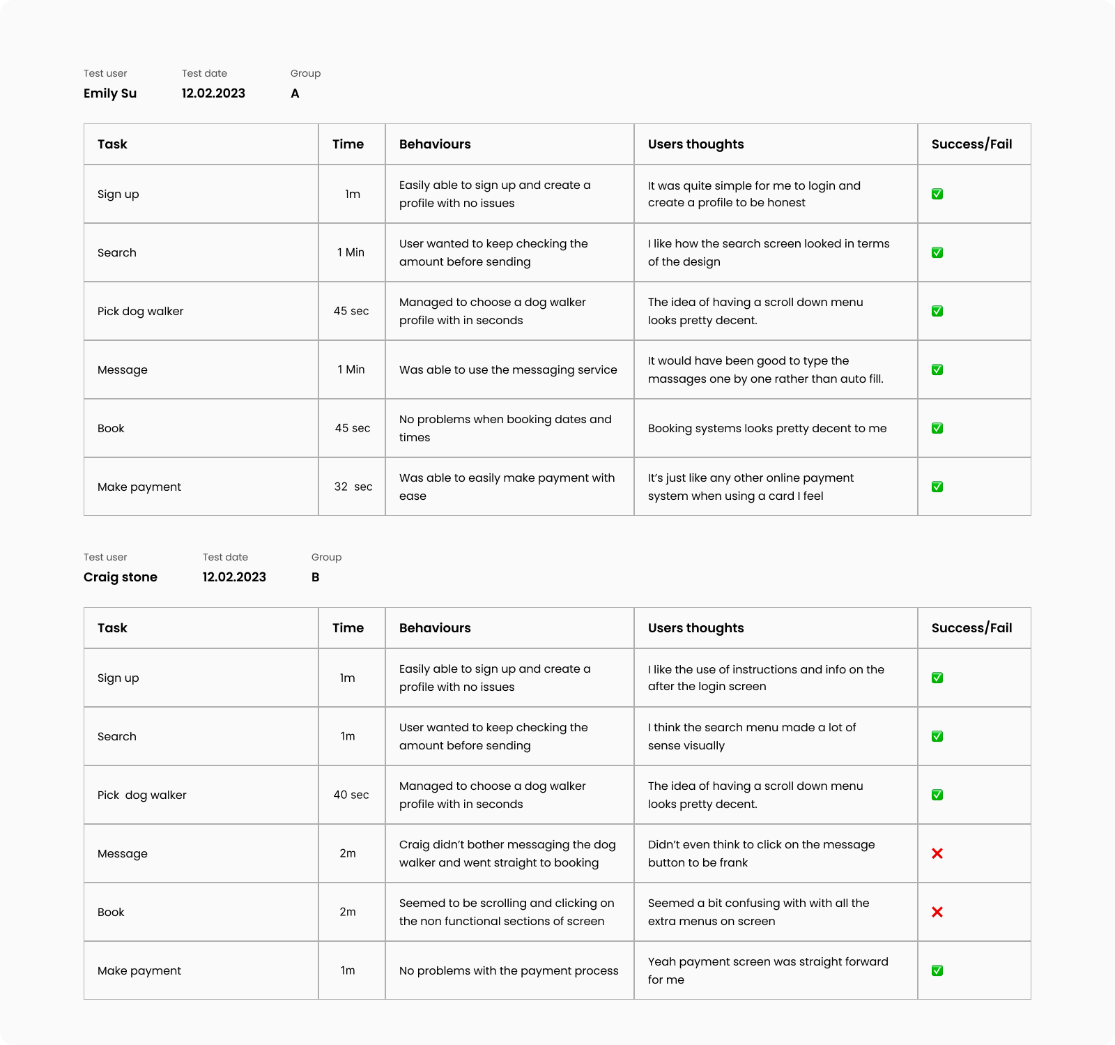
5 - 10 mins | 6 Users
I managed to gather six users who were willing to perform the 6 stages of my prototype without any assistance with two different versions of the app design. The users were split into 2 groups A and B with a team of 3 each.

Testing results
Below are examples of 2 of users I gathered from Groups A and B analysing the thoughts and behaviours of the users interaction with the prototype which had some positive and negative feedbacks.

Mood board
With the results of the testing done it was time to get inspiration for the design and imagery.
Primary choice of colour is yellow as according to colour psychology, yellow is the most visible colour and the one that the human eye perceives as being the brightest. It is the colour of the sun shining, or brilliant brightness and creativity; it signifies happiness and optimism.
Typeface was carried out using Helvetica to contribute to a clean, modern, and easily readable design. Helvetica is a sans-serif typeface known for its simplicity and versatility, making it a popular choice for various design applications

Branding
My idea behind the brand had to be memorable one that represents a animated pet-friendly tone.
So I first set myself the practical task of sketching out my design on pen and paper.
Second stage resulted in using geometric shapes such as circles as the original base layer and various other shapes with a grid system to align.
I felt “Buddy” worked well as the name brand as I remember the quote “A dog is a man’s best friend.” thous having a dog Buddy!

Ui kit
Intefaces: Utilize cards to display information about individual dogs, upcoming walks, or notifications. Ensure consistency in card design for a cohesive look
Buttons: Design buttons with a clear call-to-action. Use the app's primary color for the buttons to make them stand out.
Icons: Pre-made icons were used for actions such as saving, booking, appointments, and more.

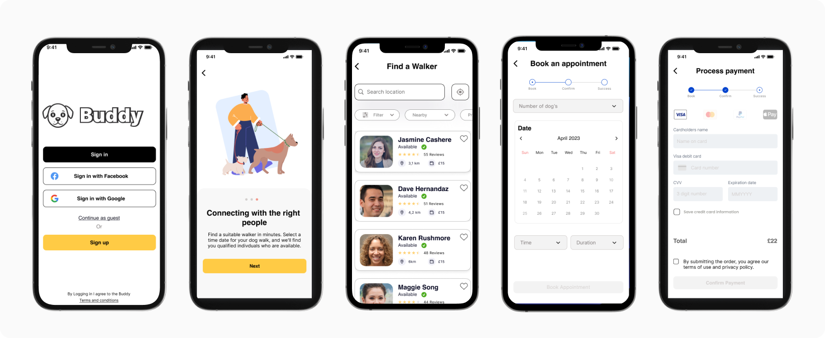
Hi-Fidelity
Creating the high-fidelity designs resulted in combining a user-friendly interface based on the UI kit, colours and fonts put together to create a visually appealing interface.
Testing + improvements
Creating the high-fidelity designs resulted in combining a user-friendly interface based on the UI kit, colours and fonts put together to create a visually appealing interface.

